Showing posts with label Blue. Show all posts

Sunday, 17 April 2011

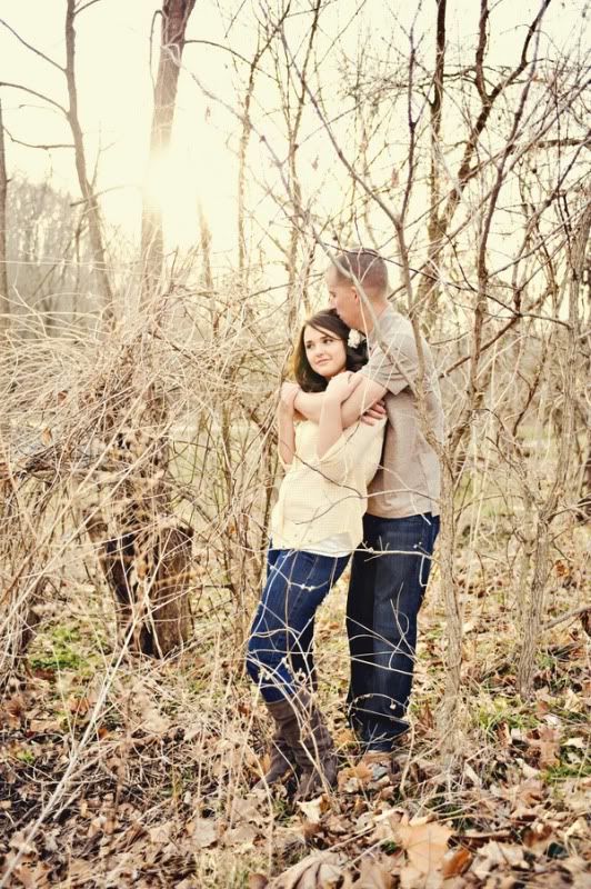
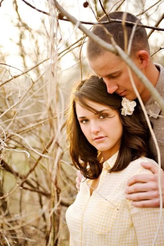
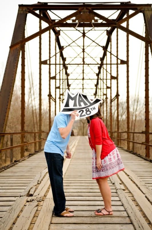
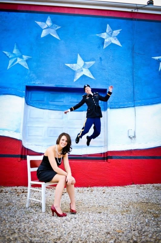
Engagement Inspiration: T & Jesamy's Sweet Military Engagement Shoot

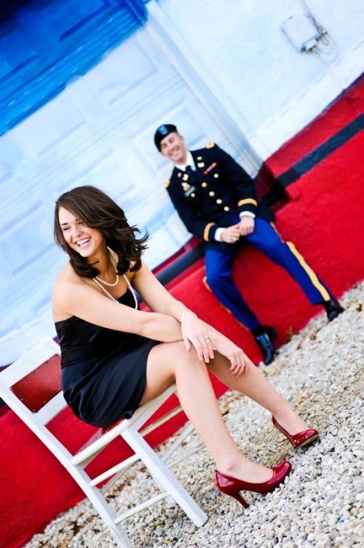
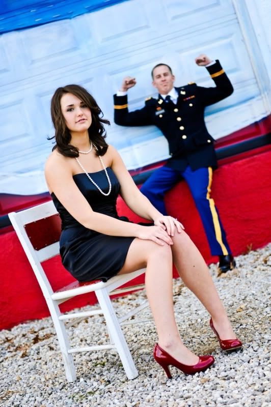
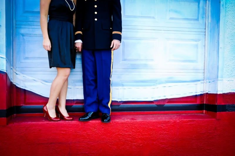
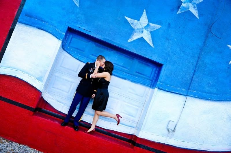
L Photography shared this super cute military engagement shoot with me and just by looking at the pictures you can tell how in love Jesamy and T are!  I love how they found a mural that provided the perfect patriotic backdrop for some of their engagement photos.  And how sweet is it that T proposed in the same spot that Jesamy's dad proposed to her mother?!?  So cute, anyway... on to the pictures!

Saturday, 9 April 2011

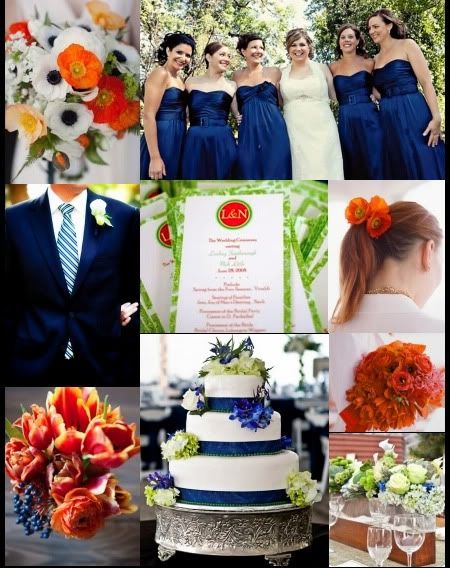
Inspiration 213: Navy, Lime and Orange-y Red

I have a pretty requested board to share today!  The bride who requested this board wants to use a navy and lime color palette with pops of orange-y red.  She wants to keep most of the orange-y red in the flowers, and I think these poppies are great. Love those navy berries too, they would definitely help tie the other wedding colors into the bouquet.

Tuesday, 29 March 2011

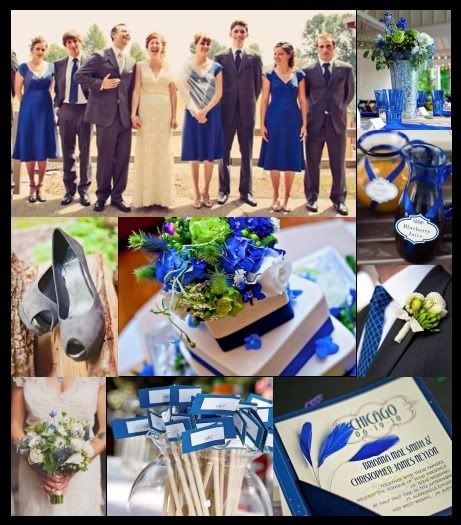
Inspiration 205: Bold Blue and Gray Wedding

I just realized that I've done a lot of gray and yellow and gray and pink boards but I haven't done any, or at least only very few, boards that paired blue and gray.  So I decided one definitely needed to happen!  For this board I combined bold cobalt blue with a slate gray and a few hints of apple green.

Friday, 25 March 2011

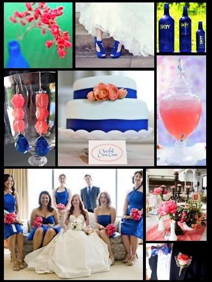
Inspiration 202: Spunky Cobalt and Coral

I am really liking bright colors and the way they make softer colors pop.  Cobalt blue is a great shade that can work for any season depending what you pair it with.  For this board I added coral, this palette would work for spring, summer and early fall.
ps- Coral peonies are just so swoon worthy!

Monday, 21 March 2011

Monday Funday 16- Skylines and Rooftops: a (500) Days of Summer Wedding

(500) Days of Summer is my favorite movie, and when I saw this (500) Days of Summer wedding shoot on Sarah Yates blog I knew I was going to make a board inspired by it!  For the wedding gown, I went with something short with a blue bow to reflect the dress Summer wore to the wedding in the movie.  I love that at the shoot they incorporated a pancake buffet, so yummy sounding.  How about blue printed dresses like the one Summer wore at her rooftop party for your bridesmaids?  And don't forget the skylines and chalkboards!

Friday, 11 March 2011

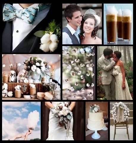
Inspiration 189: Cotton Clouds

I love the idea of adding natural cotton elements to a wedding!  It can show up anywhere from the boutonnieres to the reception decor to the cake.  And it reminds me of a beautiful sunny day with big fluffy clouds!  For the color palette I went with light sky blue, natural white, birch, khaki and chocolate brown.

Saturday, 5 March 2011

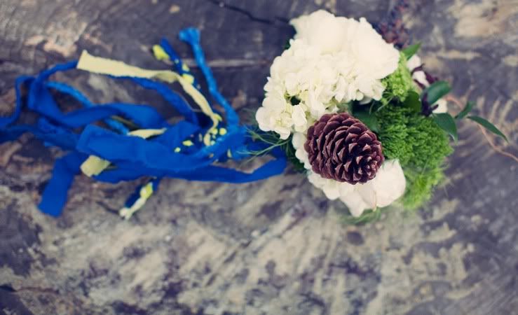
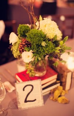
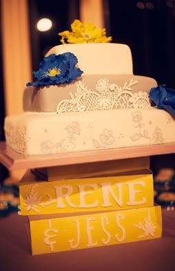
Real Wedding: Jess & Rene's Blue and Green Pinecone Wedding

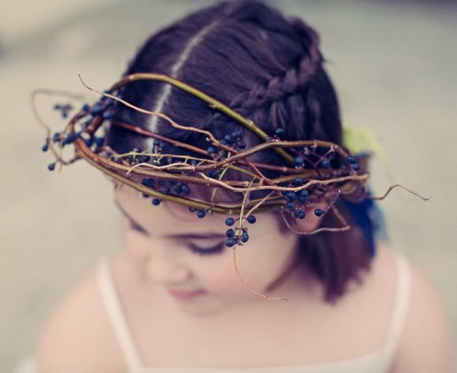
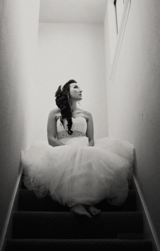
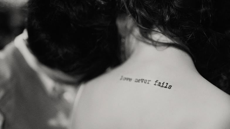
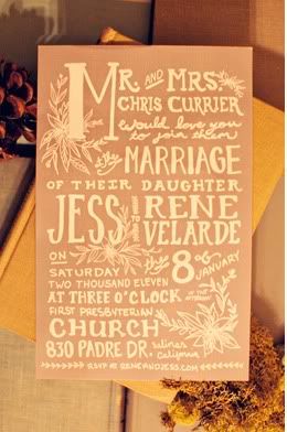
I think I am going to try and post more real weddings mixed in with the inspiration boards!  Of course, real weddings are incredibly inspirational when planning a wedding.  Today I have Jess and Rene's lovely wedding to share with you.  To see the rest of this wedding visit Clayton Austin's blog.

some details:
All photos by Clayton Austin.


Friday, 4 March 2011

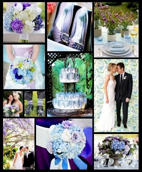
Inspiration 182: Soft Purple and Blue with a Pop

I love the way the brighter purples and blues add a pop to this soft pastel board.  Hydrangeas play a big part in this board but I love the small purple flowers in the centerpiece of the picture in the top right corner.  What do you think of this color palette?

Wednesday, 2 March 2011

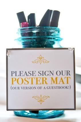
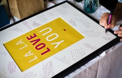
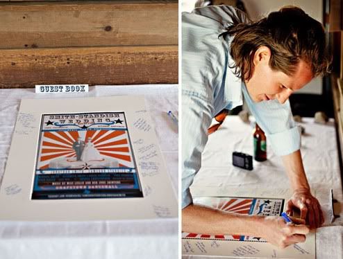
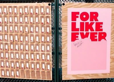
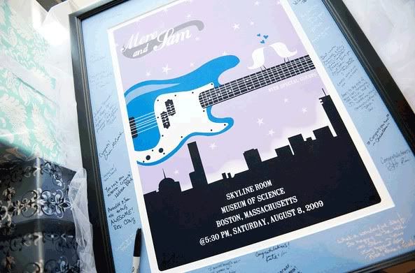
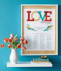
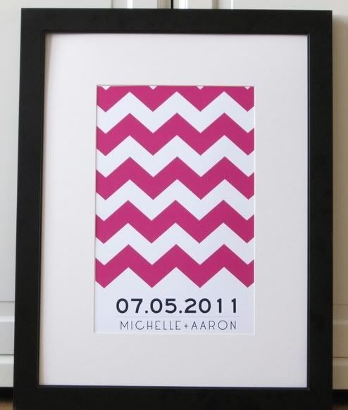
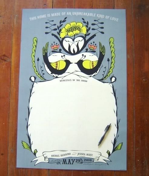
Alternative Wednesday #15: Poster Guest Books

While I still love the idea of a thumbprint tree, I always like having more options to think about.  So when I spotted these poster guest books I thought they were a great, fun alternative.  It's a great way to show your personalities and your color palette or theme.  Plus, you'll have some amazing, personal artwork for your home!

these first two images are from We Met in a Bar's wedding:
Next is a fun and personalized poster from Jonathan and Cameron's wedding on Love & Lavender:
A few more fun ones:
Sparkle and Hay 
A Brilliant Photo
Truly Smitten
And two from Etsy that I think are really awesome:
Love In Letters
Spread the Love


Monday, 28 February 2011

Delighted Client!


Delighted Client: "Michelle: I wanted to let you know I received the invitations and they are BEAUTIFUL! Everyone is soooo impressed! Thank you so much for working with me to design the perfect invitation for my daughter's wedding. Thanks! Lynn D"

We used 1,232 Glue Dots on Lynn's daughter's custom pocket folder beach wedding invitations shown above. Each invitation was nestled in an invitation box with hand-folded aqua tissue paper and hand-tied wraphia bow. When the boxed is closed, a matching 2 layer custom label boasting my hand drawn starfish gave the guests a hint of the beach themed invitation design inside. We are so delighted that Lynn and her family are pleased. xo


Monday Funday 13: Vintage Spanish Style

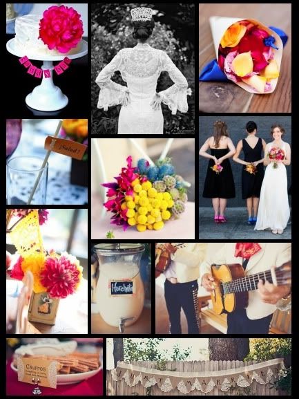
The bride who requested this board said she was torn between two styles, vintage and Spanish.  Don't worry though, there is no reason to be torn... you can combine both styles!  I think a vintage Spanish theme would be great for a wedding.  The color palette for this board is fun and bright fuchsia, yellow and blue.

Saturday, 26 February 2011

Katie & Richard


Thursday, 24 February 2011

Week in Review: Crown Princess Mette-Marit, 13-19 February

Here's what Mette-Marit wore from 13-19 February:

  1. Visiting Levanger, 17 February. Are there little poof balls on her boots? I think there are. Hmm.
  2. Attending the ISFiT conference in Trondheim, 18 February. Interesting repeated dress. The shape is almost too cutesy for her, I think the fabric's bringing up the maturity level.
  3. Other engagements in Trondheim, 18 February. Love, love this coat!
Best and Worst of the Week
On coats alone, I have to go with #3 as my best. But I can't figure out a worst: nothing's terrible, but nothing's really standing out either. Your thoughts?

Photos: Scanpix


Wednesday, 23 February 2011

Inspiration 174- Country City Fusion

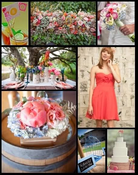
Oh, this color combo is just lovely!  The bride who requested this board wanted to work with a sophisticated white and black color palette with the flowers adding a pop of color.  She wanted to incorporate coral peonies, blue hydrangeas and pink ranunculus.  I focused this board more on the bright, pretty flowers but I really think this color combo will compliment a black and white wedding well!

Monday, 21 February 2011

Monday Funday 12: Purple Peacock

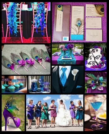
Ahhh, this board is so bright and fun!  I love the use of peacock feathers in different elements of a wedding and I think purple is a great complimentary color for them.  I love the mismatched shades of the bridesmaids dresses in this board, they work with all the colors you see in a peacock feather.  The chair decorations are really great too!

Sunday, 20 February 2011

Inspiration 171: Pink and Blue, Is It For You?

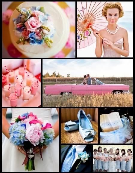
Baby pink and blue are usually reserved for just that, babies!  Lately I have been seeing a bunch of baby pink and blue weddings so I thought I'd make a board inspired by them and I actually think this color palette is really pretty.  And that pink convertible picture is really making my swoon, and want a pink car!

Bouquet Love #5 (and a Lovely Color Combo!)

I love the brightness of this color combo, and the fun addition of blue to the popular pink and orange palette!  Check out the rest of the colorful wedding at Southern Wedding Magazine.


Saturday, 19 February 2011

Carrie & Heath Program