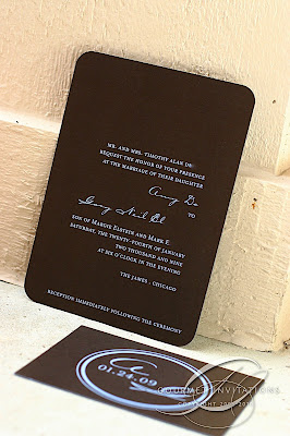
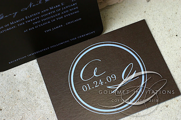
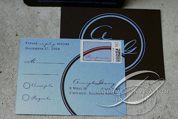
There are some invitations that when they are done, I catch my breath when I look at the final product - and then get a giddy grin on my face! These were definitely one of those. Amy contacted me AGES ago about doing ice blue printing on brown cardstock. I talked to three printers, saw demonstrations of different inks at different thicknesses and nothing really looked "quality" to me. I didn't want to do the light printing on the dark if it wasn't going to look good. So we finally gave up and decided to do brown on blue.
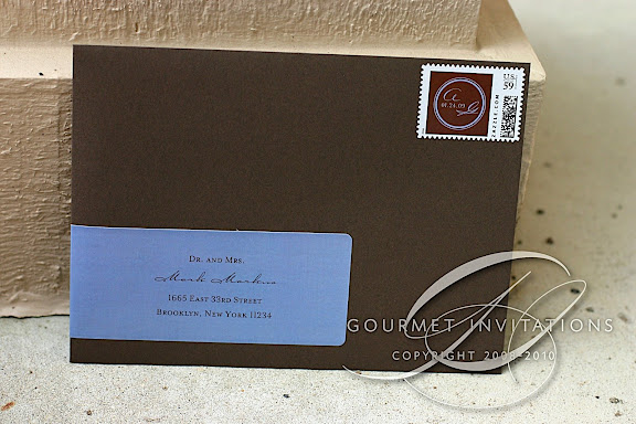
But then I discovered another process and I'm so glad I did. Amy's invitations are simply stunning. We used very formal fonts, but the layout, colors, and even little details - like simply stating "Chicago" with no state, the awesome monogram, and brown envelopes with custom stamps - it all screams contemporary and modern.
Tuesday, 11 November 2008
Amy + Gary
Subscribe to:
Post Comments (Atom)
EmoticonEmoticon