I am seriously in love with these simple but unique bouquets! The wheat really adds great visual detail and the shape of the bouquets are just so lovely.
Sorry, I just had to make the title that... I love that song! Anyway, this board has a bit of a bohemian feel to it. I incorporated feathers and a monochromatic pink palette to create this look, and I think it's lovely. I drew the color palette from the awesome ombre (means shaded in French) cake and added a cranberry pink to the flowers to really make a statement.
I love the simplicity of baby's breathe and I think it deserves a place as more than just a filler in supermarket bouquets. In this board I went with a neutral color palette and paired it up with some birch wood elements. There are some really great inspirational images in this board for incorporating both of these elements into your wedding day!
On My Fair Wedding I saw David Tutera create a safari themed wedding, which I thought was fun! To keep this from being too over the top I kept the color palette to khaki, black and white. I love the animal print shoes, the safari style bridesmaids dress and the get away jeep in this board.
This is kind of a no theme, themed board... if that makes sense! I love the idea of getting married under a big, old tree. I went with a natural and neutral brown, tan and forest green and grass green color palette for this board. Of course I incorporated a lot of wood elements too, to play off the old tree theme. The invitations on this board are super cute... I love the detail of the heart with your initials on the tree!
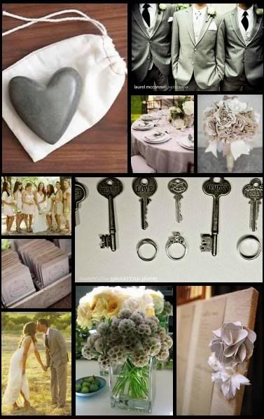
I recieved a few requests for neutral color palettes during the contest. I already posted a winter one here so today I have a neutral and gray summer (or spring or fall!) board for you! In this board I incorporated more cream, khaki and taupe. I really love the gray flowers, I wonder what kind they are?
This is one of my guest blogging boards. There are a lot of cool DIY elements on this board :) I've received a lot of great ideas for boards in the contest entries so look out for those coming up in the next few weeks! The color palette for this board is coral, yellow and craft paper.
I am getting back into making requested boards again! The bride who requested these boards is deciding between two very different themes. The first is a vintage sand and star theme. For this board I went with a aqua, teal, midnight blue, sand and gold color palette. I really, really like the way this board turned out! The second theme is Rasta. Which is totally cool and definitely fun! I went with the Rasta color scheme of red, yellow and green. I think it would be awesome to have a Rasta band at the reception too.
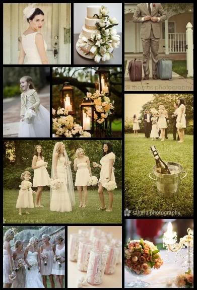
I love how romantic and summery this board came out! It's a little bit vintage as well. I usually love colorful weddings but I love the soft feel of an ivory and champagne wedding. This is the last board for mismatched bridesmaids week!
Who doesn't love chocolate and champagne? Well, they make a lovely color combo too! This was a requested board from a bride who wants to do a chocolate and champagne backyard wedding... hope you like it!
I was inspired by a candy buffet I spotted on Amy Atlas's website (check it out for other candy buffet inspiration.) The pale blue, tan and gold color palette is very elegant!
Picking wedding colors is definitely a hard decision for many brides. A bride contacted me the other day and said she was having a hard time deciding between lime and aqua or lime and natural, so I made her two boards. I hope they help!